Breakpoint media-queries: Generate media-queries and simplify responsive design
Breakpoint media-queries is a free Chrome extension developed by Michael Lancaster. It falls under the category of Browsers and specifically the subcategory of Add-ons & Tools. This extension is designed to simplify responsive design by generating media-queries and providing useful features.
With Breakpoint media-queries, users can easily generate media-queries using max-width and effortlessly identify the current screen size width. By clicking on the Breakpoint icon, users can generate code snippets for their media-queries, which can then be copied and pasted into their style sheets. This eliminates the need for manual calculations and speeds up the development process.
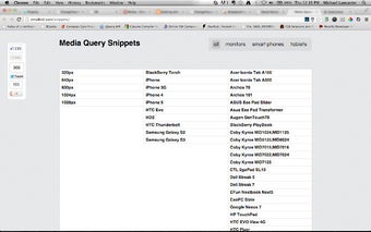
In addition to generating media-queries, Breakpoint media-queries also provides a convenient link to a list of media-queries snippets. This list includes a wide range of devices, allowing users to quickly find and implement media-queries for specific screen sizes.
The latest version, 1.0, has seen significant improvements. It has been rebuilt with vanilla JavaScript, removing the dependency on jQuery. This ensures a more lightweight and efficient extension. Previous versions, such as 0.7 and 0.6, focused on design improvements to enhance user experience.
Overall, Breakpoint media-queries is a simple yet powerful Chrome extension that streamlines the process of creating responsive designs. Its intuitive interface and useful features make it a valuable tool for web developers and designers alike.